Home » Instructions » Text Editor Module
Text Editor Module
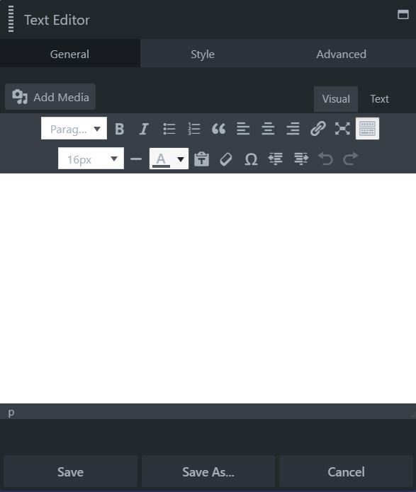
The Use the Text Editor module to add a block of text. The Text Editor module uses an instance of the standard WordPress editor. The difference is that you have more control in positioning the text on the page.
You can add headings images, and make simple changes to text formatting, just as you do in the standard WordPress editor. module lets you insert an individual photo from your WordPress Media Library or a custom URL.
Click and drag the Text Editor Module onto the page...
You can style text within the text editor itself, but on the Style tab that are a number of settings that apply to the entire body of text, such as text color, font settings, and horizontal alignment, making it easy to set and change options that apply to the entire module.
Text Color
The default color is usually specified in the theme, but you can choose a custom color here.
Typography Section
Next to the Typography heading there's an icon for responsive settings. Click this icon to add different settings for medium and small devices. If you don't add settings for each device size, the settings for the desktop will apply to all.
The Typography section has the following subsections:
Font Family
Set the font family here: a system font or any of the Google fonts.
Font Weight
If you chose a system font in Family, you can choose Light, Normal, or Bold in the Weight field. If you choose a Google font, the Weight field lists any of the styles included with that font.
Font Size
Choose the font size, with px, em, rem, or vw as the unit of measurement. If this field is empty, the default setting is used.
Line-Height
Set the amount of space used for lines of text. Specify a number value and a unit of measurement. The dash value in the units list, shown in the screenshot below, means a unitless value, which means the number value is multiplied by the element's font size. In most cases this is the preferred way to set line height, but you can also choose px or em. If this field is empty, the default line height is used.
Align
Select one of the icons to align the text to the left, center or right. The buttons in this setting are toggles. If no button is selected, the default alignment is used.
Spacing
Controls the horizontal spacing between letters, in pixels.
Transform
Allows you to change the case of the text string without retyping. It corresponds to the CSS text-transform property. The choices are, from left to right: Normal (as typed), capitalize the first letter of every word, convert all letters to uppercase, and convert all letters to lowercase.
Decoration
The choices are Default (whatever decoration is already set in the CSS for that element), None (which overrides any default decoration), Underline, Overline, and Line through.
Style
This setting corresponds to the font-style property and is used for italic and oblique settings. The Style field offers the choices of Default (whatever style is inherited), None (font is regular, meaning upright, not italic or oblique), Italic, or Oblique.
Variant
This field offers the choices of Default (whatever style is inherited), None (font is regular, meaning upright, overriding any inherited variant setting), or Small caps. The difference between Small caps and the Transform field's Uppercase is that Small caps uses larger letters for letters that are capitalized in the original text, whereas Uppercase uses capital letters of uniformly equal height. The Small caps effect is shown in the animation below.
Text shadow
A text shadow effect adds a shadow behind the text, letting you control the shadow color, direction of offset ( X is horizontal, Y is vertical), and blur, as shown in the following screenshot, in which the shadow is moved to the right and down with enough blur to preserve the shadow on individual letters but not make the background shape distinct.
The Advanced tab offers nearly identical settings on all Drag & Drop Editor rows, columns, and modules.
Spacing section
For rows and columns, you can change the default margin and padding values. For modules, you can change the default margin values only.
Visibility section
In the Breakpoint field, you can set the row, column, or module to display or hide based on device size. In the Display field, you can choose to display the row, column, or module always, never, or only to logged-in or logged-out users.
Animation section
You can assign an entrance animation, which activates the first time the page is loaded and the row, column, or module comes into view. The default is None. If you choose an entrance animation, set the delay (how long before the animation starts, in seconds) and a duration (how long the animation lasts, in seconds.).
HTML Element section
You can choose a different HTML container element for the row, column, or module (advanced users only).
For example, for reasons of accessibility you might want to use an HTML container tag that has more semantic value than a <div tag, such as <section>.
Add a CSS ID or class value to the row, column, or module.
ID names must be unique on a page, so assign an ID only when you need to reference that unique ID. For example, a link to an anchor on the page requires a unique anchor so it know exactly where to go. Class names are usually intended for reuse and are often used in CSS rules. For example, you might want to assign a different text size to all HTML headings with an fl-heading class.
