Contact Form Module
The Contact Form module displays a basic contact form with the following properties:
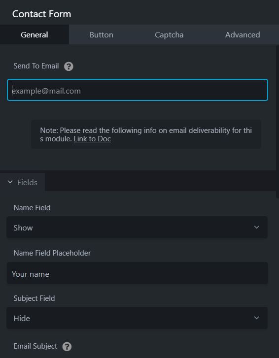
- The form can display Name, Subject, Email, Phone, and Message fields. The labels and placeholder text for these fields can be customized.
- By default, the Name and Email fields are displayed, and the Subject and Phone fields are hidden. Any fields that are displayed are required.
- There's an optional Terms and Conditions checkbox. You can add custom text above the checkbox and customize the checkbox label. If you enable the checkbox, users must select the checkbox to submit the form successfully. If they don't, they receive the message "You must accept the Terms and Conditions." One use for this checkbox is to meet GDPR requirements if you feel users must explicitly accept terms and conditions.
- You can add a Google reCaptcha button to the form to deter spam.
- The user can submit the form with either the spacebar or the Enter key.
- You can choose whether the person who submits the form sees a confirmation message or is redirected to a URL you specify.
- Email notifications are automatically sent to the designated recipient upon form submission.
Click and drag the Contact Form Module onto the page...
