Home » Instructions » Video Module
Video Module
Use the Video module to insert a video into your layout. The source can be either of the following:
- A video from the WordPress Media Library (not recommended)
- Embed code provided by a third party such as Vimeo or YouTube (recommended)
An important part of the Video module is what goes on behind the scenes. You can add structured data to meet Google's Rich Results Test. The Video module also does a great job of being responsive on smaller devices.
Click and drag the Video Module onto the page...
Video type:
There are two choices, these choices are described in the following sections.:
- Media Library
- Embed
Media Library:
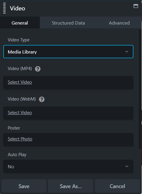
If you choose Media Library, the following additional settings are available.
| Field | Description |
|---|---|
| Video (MP4) | Add an MP4 video that you have uploaded to your media library. |
| Video (WebM) | (Optional) Select a WebM-format video from the media library to display in browsers that can't play MP4. WebM was required on some older versions of Firefox and Safari. |
| Show video on lightbox | (Default is No) The video plays in a lightbox rather than directly on the page. If set to Yes, you must enable the Poser and select a poster image, described in the following table rows. |
| Enable poster | Enable or disable a poster image that displays before the video is loaded, whether the video is displayed in a lightbox or not. If set to Yes, you must add an image to the next Poster setting. Note: If a poster image is specified, the attribute preload="none" is added to the rendered output to ask the browser not to load the video when the page loads. However, this attribute is ignored if Autoplay is set to Yes. |
| Poster | (Optional for videos that play on the page, required for videos that play in a lightbox) Select a poster image from the Media Library. If the video plays in a lightbox, the poster image displays on the main page and the video plays in the lightbox. |
| Autoplay | (Default is No) Choose whether the video should start automatically. Note: Selecting Yes doesn't guarantee your video will autoplay in all environments. Standards frequently change for whether browsers and mobile devices will autoplay videos. |
| Loop | (Default is No ) Choose whether to automatically replay the video when it ends. |
| Sticky on scroll | (Default is No) If set to Yes and the lightbox is set to No, the video stays displayed on the page while the rest of the page scrolls beneath it. |
Video Controls:
There's also a Video Controls section, all are set to Show by default.
| Field | Description |
|---|---|
| Play/pause | Show or hide the play and pause controls. |
| Timer | Show or hide the timer control. |
| Time Rail | Show the bar that displays the time progression while the video plays. |
| Duration | Show the time duration. |
| Volume | Show the volume control. |
| Full screen | Show the control to enable full-screen viewing. |
Embed:
If you set Video type to Embed, a code box appears where you can add the <iframe> embed code provided by your video service. For Youtube videos, go to the video you want to embed and click Share, then choose Embed to get the code. The StartTime and EndTime YouTube embed parameters are passed to the YouTube Player API, so you can start and end an embedded video at selected points.
With the Embed setting, the following settings are also available. See above for an explanation of these settings:
- Show video on lightbox
- Enable poster
- Poster
- Sticky on scroll
This tab lets you set information about the video that is provided in the rendered HTML output that search engines make use of, particularly Google's Rich Results feature.
If you choose Yes for Enable structured data, the following fields become available.
- Video name
- Video description
- Video thumbnail
- Upload date
The Advanced tab offers nearly identical settings on all Drag & Drop Editor rows, columns, and modules.
Spacing section
For rows and columns, you can change the default margin and padding values. For modules, you can change the default margin values only.
Visibility section
In the Breakpoint field, you can set the row, column, or module to display or hide based on device size. In the Display field, you can choose to display the row, column, or module always, never, or only to logged-in or logged-out users.
Animation section
You can assign an entrance animation, which activates the first time the page is loaded and the row, column, or module comes into view. The default is None. If you choose an entrance animation, set the delay (how long before the animation starts, in seconds) and a duration (how long the animation lasts, in seconds.).
HTML Element section
You can choose a different HTML container element for the row, column, or module (advanced users only).
For example, for reasons of accessibility you might want to use an HTML container tag that has more semantic value than a <div tag, such as <section>.
Add a CSS ID or class value to the row, column, or module.
ID names must be unique on a page, so assign an ID only when you need to reference that unique ID. For example, a link to an anchor on the page requires a unique anchor so it know exactly where to go. Class names are usually intended for reuse and are often used in CSS rules. For example, you might want to assign a different text size to all HTML headings with an fl-heading class.
