






Home » Instructions » Subscribe Form Module
Subscribe Form Module
Use the Subscribe Form module to provide a form for visitors to subscribe to an email list or to collect email addresses for your own use.
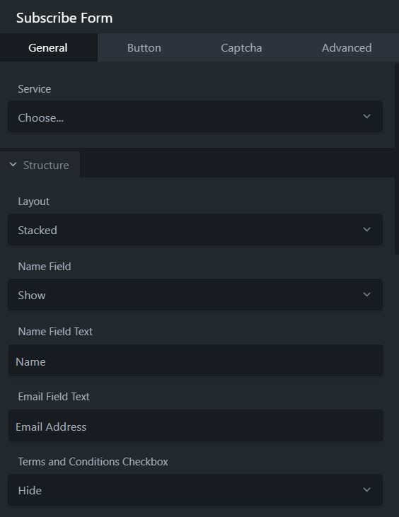
Click and drag the Subscribe Form Module onto the page...
Service:
Choose the platform that want to use.
Structure:
Setup the layout as desired.
Crop:
You can crop the photo into several geometric shapes: Landscape, Panorama (longer and shorter than landscape), Portrait, Square, Circle.
Width:
You can specify the width.
Alignment:
You can specify the alignment of the photo within the column: left, center, or right. If you display a caption, both the photo and the caption will be aligned according to this selection.
Border:
General Settings
Style:
Default | None | Solid | Dashed | Dotted | Double
Colour:
Choose a colour or preset colour.
Width:
Choose a width for the border, clicking the link will lock the widths.
Radius and Shadow
Radius:
The Radius setting rounds the corners of the border box area to round the corners of either the border line, if you set one, or the edges of a row, column, or module background.
When you click any of the Radius value fields, a slider appears to quickly adjust the value. You can make all four corners the same value by clicking the Link icon.
Box Shadow:
The Box shadow effect also works with sliders. Moving the X slider to the left adds a background shadow to the left, and moving it to the right adds a shadow to the right. You can also add blur to make it more shadow-like, and increase the spread to change the size of the shadow.
The Advanced tab offers nearly identical settings on all Drag & Drop Editor rows, columns, and modules.
Spacing section
For rows and columns, you can change the default margin and padding values. For modules, you can change the default margin values only.
Visibility section
In the Breakpoint field, you can set the row, column, or module to display or hide based on device size. In the Display field, you can choose to display the row, column, or module always, never, or only to logged-in or logged-out users.
Animation section
You can assign an entrance animation, which activates the first time the page is loaded and the row, column, or module comes into view. The default is None. If you choose an entrance animation, set the delay (how long before the animation starts, in seconds) and a duration (how long the animation lasts, in seconds.).
HTML Element section
You can choose a different HTML container element for the row, column, or module (advanced users only).
For example, for reasons of accessibility you might want to use an HTML container tag that has more semantic value than a <div tag, such as <section>.
Add a CSS ID or class value to the row, column, or module.
ID names must be unique on a page, so assign an ID only when you need to reference that unique ID. For example, a link to an anchor on the page requires a unique anchor so it know exactly where to go. Class names are usually intended for reuse and are often used in CSS rules. For example, you might want to assign a different text size to all HTML headings with an fl-heading class.