Home » Instructions » Gallery Module
FAQ
Drag & Drop Editor
- Modules Overview
- Accordion Module
- Audio Module
- Button Module
- Callout Module
- Call to Action Module
- Contact Form Module
- Content Slider Module
- Countdown Module
- Gallery Module
- Heading Module
- HTML Module
- Icon Module
- Icon Group Module
- Link to a PDF
- Map Module
- Menu Module
- Number Counter Module
- Photo Module
- Posts Carousel Module
- Posts Module
- Posts Slider
- Pricing Table Module
- Text Editor Module
- Separator Module
- Sidebar Module
- Slideshow Module
- Subscribe Form Module
- Tabs Module
- Testimonials Module
- Video Module
Gallery Module
The Gallery Module is used to display a gallery of images from either the WordPress Media Library or a SmugMug gallery that you specify.
The Gallery module is used to display a collection of individual photos in a pleasing fashion. Depending on what happens when users click a module (see the section on the module's settings), you can use the Gallery module to:
Display the series of photos one by one in a lightbox with navigation aids.
This works particularly well when the gallery images are displayed in a small size that users can open to view a larger version of the image.
Display the full-sized image on a page of its own.
This option works well when the intention is for viewers to right-click and download single images, such as for an image library.
Gallery images don't have a clickable link.
You might want to display the gallery as images that are large enough to view clearly and really don't need to be expanded to a larger size.
Gallery modules are often used as shortcodes in other modules or even in posts that use the WordPress Standard editor. For example, you could insert the shortcode for a Gallery module into a tab in the Tabs module or an item in the Accordion module to show a collection of images on a particular tab or in an expanded accordion section respectively.
There are a few different types of Gallery Modules that you can use. They all offer different options and styles.
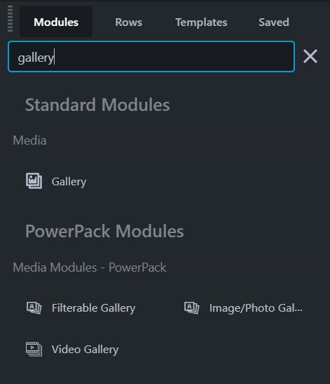
Our Favourite: We like using the "Image/Photo Gallery" under the Media Modules - PowerPack. Click and drag that module onto your page and choose the settings that best match your layout. Our preference is to use the following settings to style the Gallery.
- Layout: Grid
- Image Size: Thumbnail (or the smallest size that fits to allow the page to load quickly)
- Click Action: Lightbox
- Hover Effects: Zoom In
- Column Settings: whatever number works best with the layout
Click the icon in the upper right corner.
Click and drag the Gallery Module onto the page...
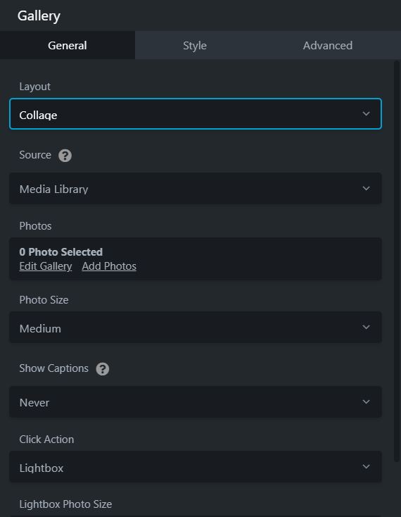
Layout:
Collage or Thumbs
Source:
Choose the WordPress Media Library. For the Media Library, in the Photos field choose the images you want to include.
Photo size:
This field appears for Collage layouts only. The Thumbs layout always displays WordPress thumbnails, either the default 150x150 or custom size you've set.
Show captions:
If you select this option, image captions are pulled from the Media Library or the SmugMug library. By default, longer captions are cut off with elliptical periods. See this article for the CSS to insert a full wrapped caption.
Click action:
Specify what happens when an image is clicked:
- None: No action.
- Lightbox: Open the image in a lightbox with Previous and Next arrows. You can choose the max size on devices large enough to display it.
- Photo link: Use the image URL to open a large-sized image displayed on a page with no theme or other formatting and no navigation links to the other images in the gallery. The large size in WordPress by default is a max height and max width of 1024px (or the full size of the image if you uploaded one less than 1024px).
Photo Spacing:
You can specify the spacing.
Border:
General Settings
Style:
Default | None | Solid | Dashed | Dotted | Double
Colour:
Choose a colour or preset colour.
Width:
Choose a width for the border, clicking the link will lock the widths.
Radius and Shadow
Radius:
The Radius setting rounds the corners of the border box area to round the corners of either the border line, if you set one, or the edges of a row, column, or module background.
When you click any of the Radius value fields, a slider appears to quickly adjust the value. You can make all four corners the same value by clicking the Link icon.
Box Shadow:
The Box shadow effect also works with sliders. Moving the X slider to the left adds a background shadow to the left, and moving it to the right adds a shadow to the right. You can also add blur to make it more shadow-like, and increase the spread to change the size of the shadow.
The Advanced tab offers nearly identical settings on all Drag & Drop Editor rows, columns, and modules.
Spacing section
For rows and columns, you can change the default margin and padding values. For modules, you can change the default margin values only.
Visibility section
In the Breakpoint field, you can set the row, column, or module to display or hide based on device size. In the Display field, you can choose to display the row, column, or module always, never, or only to logged-in or logged-out users.
Animation section
You can assign an entrance animation, which activates the first time the page is loaded and the row, column, or module comes into view. The default is None. If you choose an entrance animation, set the delay (how long before the animation starts, in seconds) and a duration (how long the animation lasts, in seconds.).
HTML Element section
You can choose a different HTML container element for the row, column, or module (advanced users only).
For example, for reasons of accessibility you might want to use an HTML container tag that has more semantic value than a <div
tag, such as <section>
.
Add a CSS ID or class value to the row, column, or module.
ID names must be unique on a page, so assign an ID only when you need to reference that unique ID. For example, a link to an anchor on the page requires a unique anchor so it know exactly where to go. Class names are usually intended for reuse and are often used in CSS rules. For example, you might want to assign a different text size to all HTML headings with an fl-heading
class.
More Information:
Tool Descriptions and links to more information
Click and Drag to move the Column
Edit Module Settings, if a module is present within the column
Duplicate the Row
Column Settings such as...
- STYLE tab:
- Width
- Minimum Height
- Equalize Heights
- Text and link colours
- Background options such as video, colour or images
- Border and drop shadow settings
Delete the Row
Save, Save as... and cancel
These options are available on most Modules and Rows.
Save
Choosing Save will simply save the active row, column or module.
Save as...
Choosing Save as... will allow you to Save the Module, Row or Column for use on other pages.
Cancel
Cancels any changes made to the active Module, Row or Column.
To Save a Template
Click the arrow in the upper left corner from within the Drag & Drop Editor to access the Tools Menu
Click Save Template
To use a Saved Template
The Templates tab (if available) contains saved layouts that can be used as templates.
Click on a Template to choose it and then choose to Append (add the Template to the page) or Replace the current page with the Template.
Page Tools
Click the arrow in the upper left corner from within the Drag & Drop Editor to access the Tools Menu
Publish layout
Publishes the layout without closing the Drag & Drop Editor.
Save Template
This allows you to save the current layout as a template that can be used on other pages or posts.
Duplicate layout
Copies the entire page and all metadata from the back end, including Yoast SEO data. Creates and opens a new page or post with "copy" in the title.
Preview layout
Opens a preview screen, where you can preview as a small, medium, or large device. Click Continue editing to return to the Drag & Drop editing screen.
Responsive editing
Edit your layout directly in a medium or small device view. Click Exit to return to large screen editing.
Revisions
Display the previously published revisions available to revert to. The number of revisions available is displayed in brackets. This menu item uses the core WordPress revision feature but makes it more convenient to view and access revisions. See this article for more information.
Global settings
Drag & Drop Editor settings that apply as defaults. Most of these settings can be overridden on individual pages. There's also a CSS and JavaScript tab to enter CSS and JavaScript that will apply to content layout throughout your site.
Change UI brightness
This option is a toggle that changes the UI skin from light (default) to dark and back.
WordPress admin
Choosing this option opens a submenu with shortcuts to get to popular spots in the WordPress admin by opening a new browser tab.